

The same principles for PowerPoint construction that you learned for ITV pretty much apply with a few exceptions. The most important of these exceptions is the imbedding of Avi, Mov, Mpeg and Wav files. These files are lost in the conversion to streaming media. However, they can be created as separate streaming media files.
Background and Text: Your background should provide high contrast with your text. Darker background with lighter text and vice versa lighter background with darker text. The contrast between the background and text allows the text to stand out.
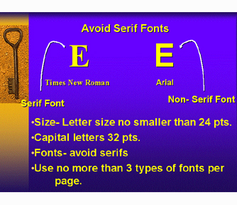
Font: You should use a non sans-serif font such as Arial or Helvetica for your text. Avoiding using san-serif fonts as they serifs can cause for example a E to look like a B. Fonts size should be no less than 24 pts and Capitalized Text not less than 32 pts. To avoid confusing your viewers use no more that three types of fonts per page.
Lines: Use no more than six lines per page.
Underlines and Italics: Limit the use of Underlining and Italics as their overuse may undermine the information conveyed. Uses these styles sparing and only where appropriate.
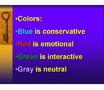
Color:
Blue is conservative
Red is emotional
Green is inactive
Gray
is neutral
Slide
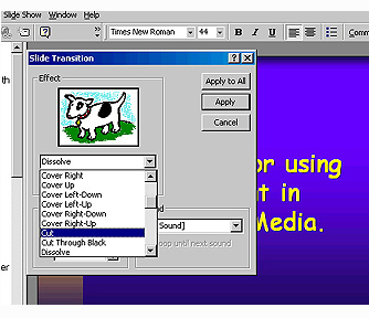
Transitions and Animations: Slide transitions should be limited to
cuts and animations in the slide to appear. There are two reasons for this,
the first is that when the slides are converted to streaming media slides
transitions are lost in the